Night Mode atau lebih sering disebut dengan mode malam yang merupakan salah satu fitur untuk menampilkan tampilan gelap, bak kondisi di malam hari dalam aplikasi dan website. Fitur ini sangat cocok sekali bagi kamu yang hobi mempercantik tampilan blog atau website pribadi.
Di samping dapat mempercantik tampilan suatu web dan aplikasi, fitur Night Mode ini dipercaya dapat meringankan dan menghemat data pengguna jika sedang mengakses aplikasi dan website yang menggunakan fitur Night Mode atau Dark Mode ini.
Nah, di kesempatan kali ini penulis akan memberikan satu tutorial singkat Cara Membuat Night Mode dengan Efek Bintang Jatuh di Blogger. Jika kamu tertarik untuk, membuat dan memasang nya pada blog, kamu bisa simak dalam tutorial berikut ini.
Tutorial
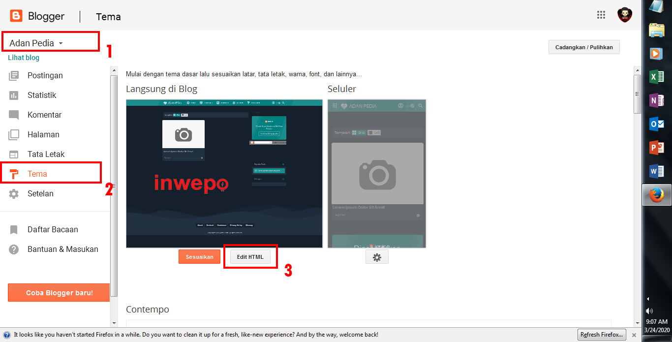
1. Log In ke Blogger – Tema – Edit Html.
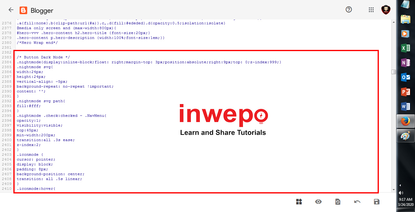
2. Copy dan Pastekan kode Style CSS di bawah ini sebelum kode ]]></b:skin> atau </style>

Lihat Kode CSS
* Button Dark Mode */
.modedark{display:inline-block;float: right;margin-top: 3px;position:absolute;right:45px;top: 0;z-index:999;}
.modedark svg{
width:24px;
height:24px;
vertical-align: -5px;
background-repeat: no-repeat !important;
content: '';
}
.modedark svg path{
fill:#fff;
}
.modedark .check:checked ~ .NavMenu{
opacity:1;
visibility:visible;
top:45px;
min-width:200px;
transition:all .3s ease;
z-index:2;
}
.iconmode {
cursor: pointer;
display: block;
padding: 8px;
background-position: center;
transition: all .5s linear;
}
.iconmode:hover{
border-radius: 100px;
background: rgba(0,0,0,.2) radial-gradient(circle, transparent 2%, rgba(0,0,0,.2) 2%) center/15000%;
}
.check {
    display: none;
}
.modedark .iconmode .openmode{
display:block;
}
.modedark .iconmode .closemode{
display:none;
}
.modedark .check:checked ~ .iconmode .openmode{
display:none;
}
.modedark .check:checked ~ .iconmode .closemode{
display:block;
}
/* Warna Dark Mode */
/* Warna Wanjay.com Night Mode */
.Night #wrapper {background: #292e38;}
.Night #HTML3 {background:#1d2129;}
.Night #footer-widget-container {background:#1d2129;}
.Night .share-this-pleaseeeee {background:#292e38;}
.Night .related-post h4{background:#292e38;}
.Night #label-info-th {background:#1d2129;}
.Night body {background:#1d2129;}
.Night .post-body {color:#cccccc}
.Night #baca-juga h2 {color:#cccccc;background:#1d2129}
.Night .label-info-th a {color:#cccccc;background:#3d4658}
.Night li.recent-posts a{color:#cccccc}
.Night .recent-posts-title h2{color:#cccccc}
.Night .Recent_Post_Mas_Tamvan .recent-post-mas-tamvan span.mastamvan_title a{color:#cccccc}
.Night span.mastamvan_title a .Recent_Post_Mas_Tamvan .recent-post-mas-tamvan {color:#cccccc;background:#1d2129}
.Night .Recent_Post_Mas_Tamvan .recent-post-mas-tamvan .widget-content {color:#cccccc;background:#1d2129}
.Night .post-info {color:#cccccc}
.Night {background:#1d2129;}
.Night h2.post-title a {color:#9e9e9e;}
.Night h2.post-title a:hover {color:#f17f43}
.Night .post-title {color:#1e90ff}
.Night ul.nav-social {color:#1d2129}
.Night .post-snippet {color:#cccccc}
.Night #ignielNewsletter {background:#292e38;}
.Night #Label1{background:#292e38;}
.Night .post{background:#292e38;border-bottom-color: #252a33;}
.Night .PopularPosts h2{background:#343944;}
.Night .latest-post-title h2{background:#292e38;border-bottom-color: #313640;}
.Night .newspaptext{color:#9e9e9e}
.Night .PopularPosts h2 span{color:#9e9e9e}
.Night .list-label-widget-content ul li {border-bottom-color: #313640;}
.Night .img-thumbnail img {background: #252931 linear-gradient(to right, rgba(255, 255, 255, 0) 5%, rgb(49, 54, 64) 20%, rgba(255, 255, 255, 0) 30%);background-size: 800px 104px;}
.Night #ignielNewsletter .medsos__ {border-top-color: #313640;}
.Night #footer-container{background:#12161f;}
.Night #footer-navmenu{background:#171b25;}
.Night .sidebar h2 {color:#b7b7b7;border-bottom-color: #313640;}
.Night .sidebar-sticky h2 {color:#b7b7b7;border-bottom-color: #313640;}
.Night .latest-post-title h2 {color:#b7b7b7;border-bottom-color: #313640;}
.Night .above-post-widget h2 {color:#b7b7b7;border-bottom-color: #313640;}
.Night .comments h3 {color:#b7b7b7;border-bottom-color: #313640;}
.Night .breadcrumbs {color:#b7b7b7;border-bottom-color: #313640;}
.Night .btnsocialshare {background:#383c44;}
.Night .label-line::before{background: #1d2129;}
.Night .label-line-c::before {background: #333740;}
.Night a.showcontent:hover {background: #373a42;}
.Night a.showcontent{background: #292e38}
.Night #ignielNewsletter input{background: #272b33;border-color:#2b303a;}
.Night .comments .comments-content .comment-content {color:#ffffff}
.Night div#Label1 h2 {border-bottom: 1px solid #272b33;background: #343944;}
.Night .related-post-style-3 .related-post-item-title {color: #bbb;}
.Night #baca-juga ul {border: 2px solid #333740;}
.Night #baca-juga h2 {border: 2px solid #292e38;}
.Night #comments a.hiddencontent {background: #424854;}
.Night .comments .comments-content .comment-thread ol {background: #292e38;}
.Night .comments .comments-content .inline-thread {background: #292e38;}
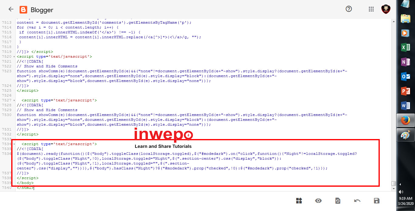
3. Masukan kode JavaScript di bawah ini tepat sebelum kode </body>

Lihat Kode Javascript
<script type='text/javascript'>
//<![CDATA[
$(document).ready(function(){$("body").toggleClass(localStorage.toggled),$("#modedark").on("click",function(){"Night"!=localStorage.toggled?($("body").toggleClass("Night",!0),localStorage.toggled="Night",$(".section-center").css("display","block")):($("body").toggleClass("Night",!1),localStorage.toggled="",$(".section-center").css("display",""))}),$("body").hasClass("Night")?$("#modedark").prop("checked",!0):$("#modedark").prop("checked",!1)});
//]]>
</script>
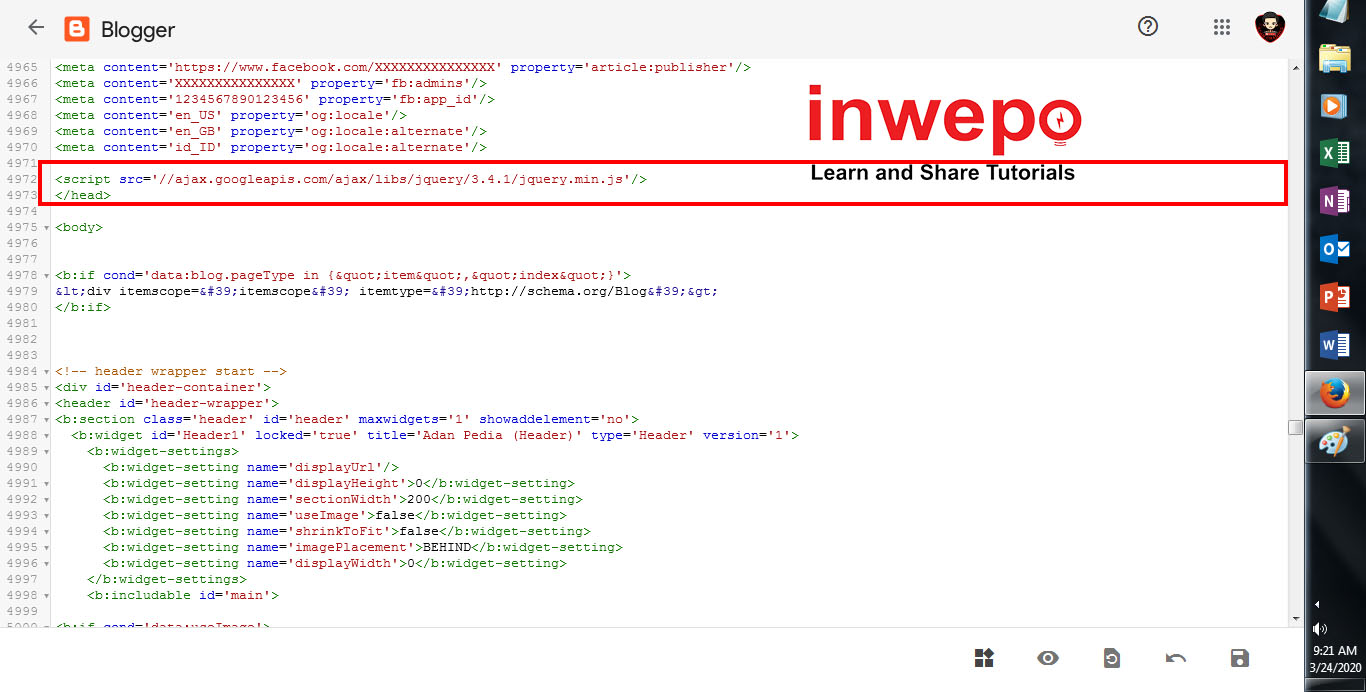
4. Selanjutkannya, kamu pasang script jquery.min.js dengan cara pastekan script di bawah ini tepat sebelum kode </head>

<script src='//ajax.googleapis.com/ajax/libs/jquery/3.4.1/jquery.min.js'/>
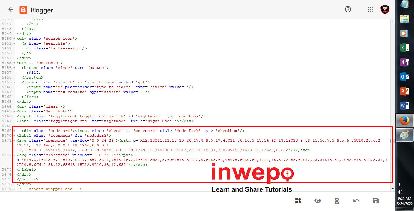
5. Terakhir, kamu hanya perlu memasang kode pemanggil nya. Untuk penempatan nya, bisa kamu sesuaikan sesuai selera kamu.
Sebagai contoh, disini penulis memasang nya di bagian header Blogger dan memasukan kode pemanggil sebelum kode </header>

Lihat Kode Header
<div class='modedark'><input class='check' id='modedark' title='Mode Dark' type='checkbox'/>
<label class='iconmode' for='modedark'>
<svg class='openmode' viewBox='0 0 24 24'><path d='M12,18C11.11,18 10.26,17.8 9.5,17.45C11.56,16.5 13,14.42 13,12C13,9.58 11.56,7.5 9.5,6.55C10.26,6.2 11.11,6 12,6A6,6 0 0,1 18,12A6,6 0 0,1 12,18M20,8.69V4H15.31L12,0.69L8.69,4H4V8.69L0.69,12L4,15.31V20H8.69L12,23.31L15.31,20H20V15.31L23.31,12L20,8.69Z'/></svg>
<svg class='closemode' viewBox='0 0 24 24'><path d='M14.3,16L13.6,14H10.4L9.7,16H7.8L11,7H13L16.2,16H14.3M20,8.69V4H15.31L12,0.69L8.69,4H4V8.69L0.69,12L4,15.31V20H8.69L12,23.31L15.31,20H20V15.31L23.31,12L20,8.69M10.85,12.65H13.15L12,9L10.85,12.65Z'/></svg>
</label>
</div>
6. Simpan Tema.
Sampai disini kamu sudah berhasil membuat dan memasang Fitur Night Mode di Blogger, namun masih dengan tampilan flat atau biasa-biasa saja. Langkah selanjut nya yang harus kamu lakukan adalah memasang Efek Bintang Jatuh nya.
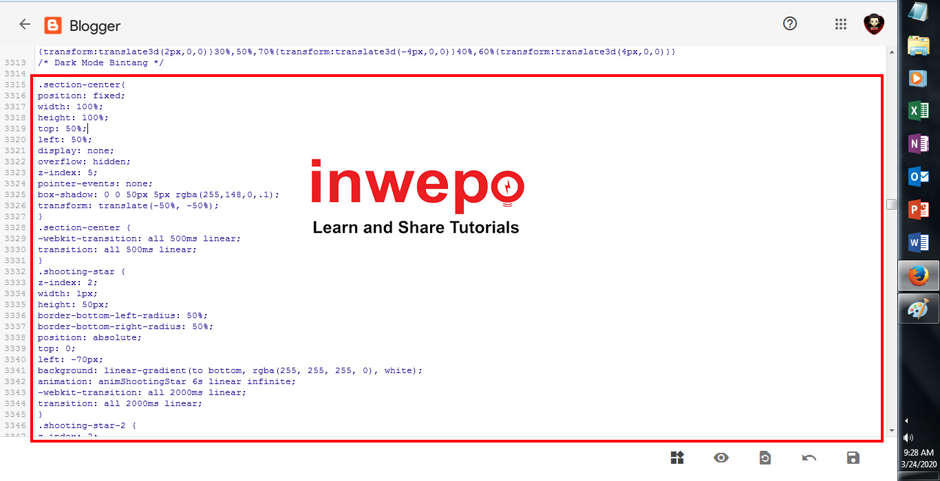
Menambahkan Efek Bintang Jatuh
1. Masih dalam mode Edit Html, kamu pastekan kode Style CSS di bawah ini sebelum kode ]]></b:skin> atau </style>

Lihat Kode CSS
.section-center{
    position: fixed;
    width: 100%;
    height: 100%;
    top: 50%;
    left: 50%;
    display: none;
    overflow: hidden;
    z-index: 5;
 pointer-events: none;
    box-shadow: 0 0 50px 5px rgba(255,148,0,.1);
    transform: translate(-50%, -50%);
}
.section-center {
    -webkit-transition: all 500ms linear;
    transition: all 500ms linear;
}
.shooting-star {
 z-index: 2;
 width: 1px;
 height: 50px;
 border-bottom-left-radius: 50%;
 border-bottom-right-radius: 50%;
 position: absolute;
 top: 0;
 left: -70px;
 background: linear-gradient(to bottom, rgba(255, 255, 255, 0), white);
 animation: animShootingStar 6s linear infinite;
 -webkit-transition: all 2000ms linear;
 transition: all 2000ms linear;
}
.shooting-star-2 {
 z-index: 2;
 width: 1px;
 height: 50px;
 border-bottom-left-radius: 50%;
 border-bottom-right-radius: 50%;
 position: absolute;
 top: 0;
 left: 200px;
 background: linear-gradient(to bottom, rgba(255, 255, 255, 0), white);
 animation: animShootingStar-2 9s linear infinite;
 -webkit-transition: all 2000ms linear;
 transition: all 2000ms linear;
}
.star {
 z-index: 2;
 position: absolute;
 top: 185px;
 left: 25px;
 background-image: url('https://ivang-design.com//svg-load/air/star.png');
 background-size: 15px 15px;
 width: 15px;
 height: 15px;
 opacity: 0.4;
 animation: starShine 3.5s linear infinite;
 -webkit-transition: all 1200ms linear;
 transition: all 1200ms linear;
}
.star.snd {
 top: 100px;
 left: 310px;
 animation-delay: 1s;
}
.star.trd {
 top: 130px;
 left: 100px;
 animation-delay: 1.4s;
}
.star.fth {
 top: 190px;
 left: 200px;
 animation-delay: 1.8s;
}
.star.fith {
 top: 85px;
 left: 1080px;
 animation-delay: 2.2s;
}

@keyframes animShootingStar {
 from {
  transform: translateY(0px) translateX(0px) rotate(-45deg);
  opacity: 1;
  height: 5px;
 }
 to {
  transform: translateY(1280px) translateX(1280px) rotate(-45deg);
  opacity: 1;
  height: 800px;
 }
}
@keyframes animShootingStar-2 {
 from {
  transform: translateY(0px) translateX(0px) rotate(-45deg);
  opacity: 1;
  height: 5px;
 }
 to {
  transform: translateY(1920px) translateX(1920px) rotate(-45deg);
  opacity: 1;
  height: 800px;
 }
}

@keyframes starShine {
 0% {
  transform: scale(0.3) rotate(0deg);
  opacity: 0.4;
 }
 25% {
  transform: scale(1) rotate(360deg);
  opacity: 1;
 }
 50% {
  transform: scale(0.3) rotate(720deg);
  opacity: 0.4;
 }
 100% {
  transform: scale(0.3) rotate(0deg);
  opacity: 0.4;
 }
}
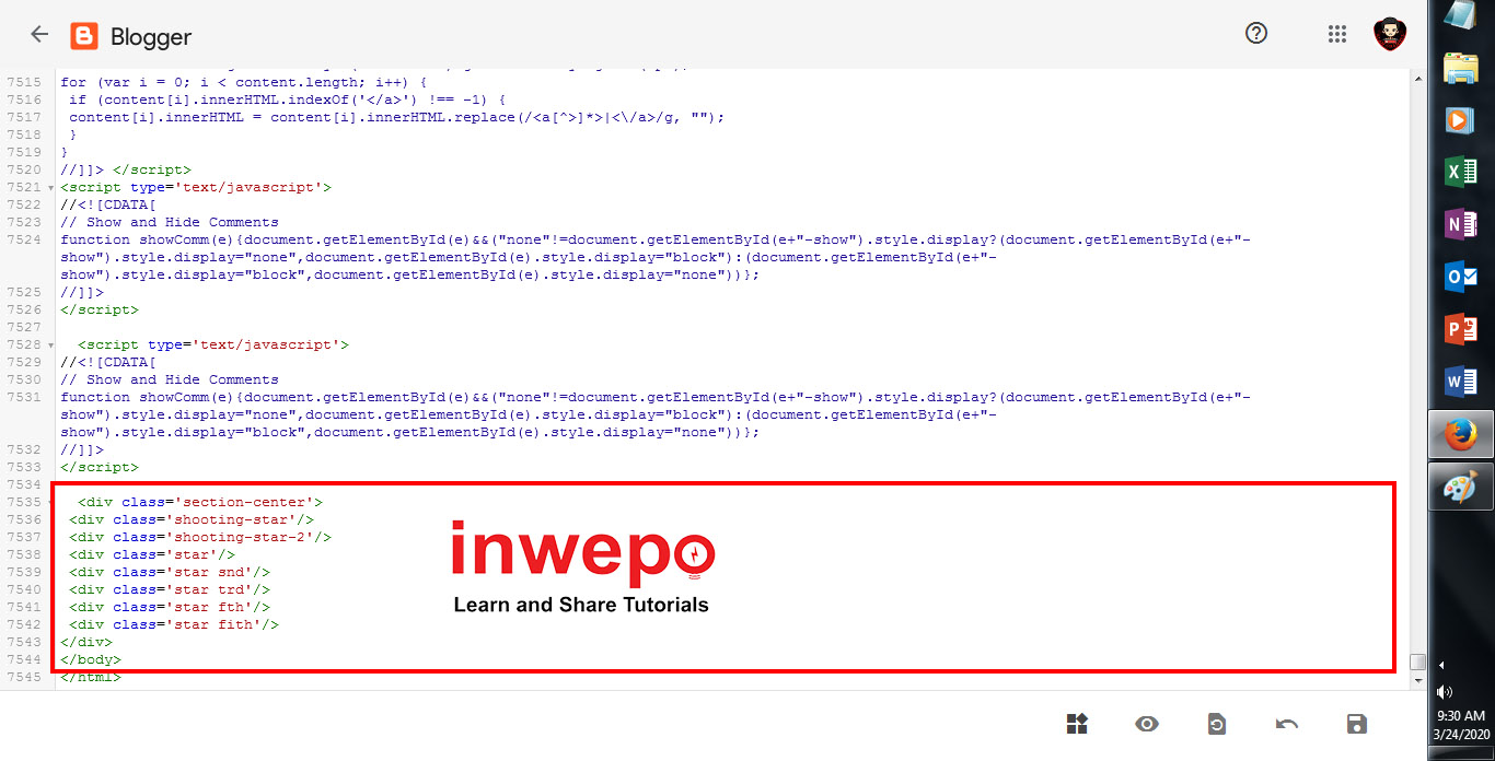
2. Terakhir, masukan kode JavaScript di bawah ini tepat sebelum kode </body>
Lihat Kode Javascript
<div class='section-center'>
 <div class='shooting-star'/>
 <div class='shooting-star-2'/>
 <div class='star'/>
 <div class='star snd'/>
 <div class='star trd'/>
 <div class='star fth'/>
 <div class='star fith'/>
</div>
3. Simpan Tema.
4. Selesai.
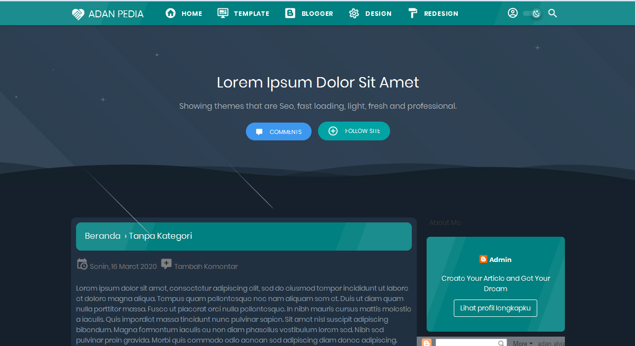
Berikut adalah tampilan Night Mode dengan Efek Bintang Jatuh yang telah terpasang di Blogger.

Sekian tutorial Cara Membuat Night Mode dengan Efek Bintang Jatuh di Blogger yang telah penulis bagikan untuk kamu. Semoga bermanfaat.